Posts Tagged ‘Goals’

Updated Raw Expt Pts post 2018 Championship

November 22, 2018

The last published Expected Points (Expt Pts) numbers are contained here. I would strongly recommend that everyone, whether you are currently using Expt Pts or not, (re)read this piece as it outlines the methodology used and more importantly the inherent weaknesses in the numbers.

Changes since last publication

Those numbers were produced in early 2018 but had not baked in the 2017 returns … so in effect were created off Championship data up to and including the 2016 season. Some 70 Championship games have been added to the database since then so it is time to update the numbers.

A quick review of some changes

a) Firstly all attempts, inside Section 8, have been coded as being with the hand or the foot. This does not get anywhere near representing the quality of goal chances but, as can be seen in the differences for both, is a worthwhile change.

b) Secondly the raw averages have been dispensed with and instead a weighting is now in effect; 30% of total outcomes are taken from the two most recent years with 20% each for the two years preceding this. What is happening in more recent years is more prevalent in the Expt Pts output but we spread the return across the four most recent years to ensure any one year change/blip does not completely overwhelm the model.

c) This is the case except for rarer shots (sideline attempts, 45s, penalties etc.). For these we take all the shots in the database rather than applying the weighting. This gives us more certainty on the numbers.

Outcomes
Yes. Yes. Yes. We understand – just give us the bloody numbers …

Caveats
As ever Expt Pts is not the be all and end all. It is another tool to use when honing in on shooting efficacy. One tool (albeit a better one than Conversion Rates). No more, no less.

Consider these numbers as “Raw Expt Pts”. No overlay. No subjectivity. They are the product of the 80:20 rule. A newer model, which overlays strength of competition and game state, is currently in production. The thought behind this updated version is expanded upon here.

That will undoubtedly produce better numbers but it is not necessarily something that can be transferred easily to club football. As such the numbers here are better in that respect.

Happy statting.

Early Conversion Rates are poor – why?

November 10, 2016

Early Conversion Rates

Whilst uploading the 2016 data into the database I was noodling around in the numbers and produced a simple chart for production on Twitter.

graph-1-overview

Something was quite obviously happening in the first 10 minutes that saw the cumulative Conversion Rates much lower than the average. There were two initial thoughts

1. a number of “lower level” teams were dragging the average down early in games (either through just poor shooting or an inability to get “quality” shots off against better teams early on when the scoreboard was close)
2. shooting types, and where shots were being taken from, were so different in the frantic opening periods of games that the early Conversion Rates were being skewed

Upon doing some more superficial digging it appears that neither were the case

1. Conversion Rates by teams

graph-2-by-team

The phenomenon (of Conversion Rates being lower early on) was observed in three of the four semi-finalists (NOTE1) whilst all other teams followed the overall trend to a tee. The only outliers – unsurprisingly – were Dublin.

2. Expected Points over time

graph-3-expt-pts

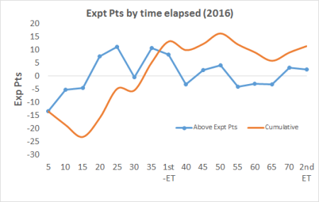
The above is a replica of the Conversion Rate chart but replacing Conversion Rates with Expected Points (Expt Pts). Although the shape of the chart is different than the original the occurrence of poor early returns is still evident. And by using Expt Pts we remove the shooting types as an issue as Expt Pts bakes in the difficulty of a shot (NOTE2). All shots are being converted at a lower rate than expected until around the 30th minute but teams are noticeably struggling in the first 15 minutes.

Conversion Rates by shot type

So the phenomenon is real but cannot be attributed to a specific team type nor to shot selection/execution. It is across the board except for Dublin. Three shots types – free kicks, point & goal attempts from play – make up ~97% of all shots. Is there anything we can determine from investigating these shot types independently to explain this poor shooting in those early exchanges? And is there anything therein that explains how Dublin are managing to avoid this poor shooting early on?

Free kicks

graph-4-by-free

This is probably the most surprising, and hardest to attribute, of all the results. When the very first chart was produced on Twitter I mischievously suggested that whatever all the back-up teams were doing to get teams warmed up they needed to change it. There were some good responses re the intensity of teams, especially in the pressure applied to shots, being higher early on. Or that teams were defensively more conservative early on leaving less space for clear shots. All plausible and probably have a grain of truth. However none applicable to free kicks – and the phenomenon of poor conversion rates early on is noticeable here too.

Now by slicing the volumes into the first 10 minutes of one season’s games we are running in to sample size issues. Specifically for this segment the volume is 47 so this comes with a rather large health warning.

Assuming games are now 80 minutes the first 10 minutes make up 12.5% of the game; the 47 frees in the first 10 minutes make up 13% of all frees. On top of that the two main free takers – D Rock & C O’Connor – make up 21% of all frees in the first 10 minutes whereas they make up 25% of all frees in the database for 2016. So the first 10 minutes, low sample size and all, are representative of the whole year. So what happens in those opening 10 minutes?

Shots Scores Expt Pts Conversion % v Expt Pts
All frees 47 29 32.8 62% -3.8
Rock & O’Connor 10 9 7.8 90% +1.2
Others 37 20 25.0 54% -5.0

What the above table shows is that Rock & O’Connor were on point from the get go. Overall for the year they combined for an 86% Conversion Rate and in the first 10 minutes they were 90%.

If the two main protagonists were on point the rest of the free takers must be dragging the averages down from 71% overall to 62% in the first 10 minutes. And as the table shows this is the case. Indeed they were very poor returning a paltry 54% (the 80 minute average for all free takers outside Rock & O’Connor was 66%).

And this somewhat negates the argument for lower Conversion Rates early on being affected by what the opposition’s defence is doing. The opposition can’t really affect free taking. Outside of Rock & O’Connor it looks like free takers were just not ready early on (NOTE3).

Points from play

graph-5-from-play

The Conversion Rate for 2016 was 44.2% and for the five years from 2012 was 45.8%. For the first 10 minutes of 2016 games the conversion rate was 36% and only rose to a cumulative 38% by 20 minutes. Again the Expt Pts was lower in the first 10 minutes (-15.70) as against the remainder of the game (+5.84).

I do track whether a shot was taken under pressure however have only used it anecdotally to date as it is a simple “Y/N” flag and is probably not nuanced enough for any concrete use. Having said that however there is only one person applying the flag so we would expect a certain degree of consistency of application across the ~1,000 shots tracked here.

In the first 10 minutes I charted 53.6% of all point attempts occurring whilst under pressure. The remainder of the time it was 54.2%. Near enough as makes no difference.

So the poor shooting for points from play is real, is not linked to poorer shot types (as evidenced by the Expt Pts return) and from the empirical data we have is not linked to greater pressure applied earlier on in the game. I am completely open to the intensity of the pressure being different early on (NOTE4) but if this was the case you would expect some uptick early on in the percentage of shots marked as taken under some/any pressure in this timeframe. There is none.

There may be other non measurable factors such as nerves (these are amateurs after all) but as of now I can’t come up with anything other than the aforementioned “mischievous” reason that players are just not at peak performance early on. Maybe this is to be expected?

So what of Dublin? We saw that their early conversion Rates outperformed everyone else. This is in part due to the fact that Dean Rock went 5 from 5 on his frees but how was their shooting from play?

Shots Scores Expt Pts Conversion % v Expt Pts
Dublin 23 9 10.2 39% -1.2
Mayo 28 8 12.0 29% -4.0
Tyrone 19 8 8.7 42% -0.7
Donegal 17 4 7.4 24% -3.4
Tipperary 13 5 6.8 38% -1.8
All first 10 179 65 80.7 36% -15.7

Again volumes are low (NOTE5) but Dublin were no great shakes early on. Yes they were above the average for the first 10 minutes but they still underperformed when compared to the whole game average and their Expt Pts – like all the teams above – was below 0.00.

Perhaps the most striking return here is Mayo. From the 10th minute onwards they were exactly in line with Dublin (Mayo 49% on 126 shots with an Expt Pts of +5.59; Dublin 49% on 132 shots with an Expt Pts of +5.54) but for those first 10 minutes they were much poorer.

Another theory for the poor start was not where teams were shooting from but who was shooting – less pressure on returns early on so midfielders/defenders were more inclined to “have a pop”. So I had a look at Mayo’s shot distribution. In the first 10 minutes 64% of their shots came from what I would state are obvious offensive players (A Moran, A O’Shea, J Doherty, A Dillon and the two O’Connor’s). From the 10th minute onwards, and adding E Regan, C O’Shea and A Freeman to this mix who didn’t have a shot in the first 10, these forwards accounted for 60% of point attempts (NOTE6).

It is difficult to attribute offensive/defensive tags to all players in today’s game but if there was a decisive split in who was shooting for teams you would expect it to show up in the team with perhaps the worst split. But it doesn’t.

Goal Attempts

graph-6-goal-attempts

To be honest I am just including the above for consistency and to help explain Dublin’s apparent ability to start faster than others. Whilst I have consistently cautioned against low sample sizes it is an overarching feature of this shot type and can explain a lot of the variance within the five minute groupings above. In total there were 137 goal attempts with just 15 in the first 10 minutes and 36 within the first 20.

Having said all that …. the Conversion Rate for goal attempts was 53% in 2016 and only crawled up to 40% after 15 minutes. With the evidence we have teams again were not converting on goal attempts early on in games.

Dublin? They had six goal attempts in the first 10 minutes scoring 3-00. 50%. And there is their apparent early start in a nutshell. They were 50% on goal attempts, 100% on deadballs (as well as Rock’s aforementioned frees he was 2 from 2 on 45s as well) and slightly below average at 39% on point attempts – giving them the aggregate of ~52% early doors.

Overview

This is based on one year’s data (NOTE7) but poor early conversion rates were definitley a “thing” that year

There is no evidence that shot selection (through Expt Pts), opposition pressure (through the simple “Y/N” flag) nor type of shooter (using Mayo as an example) is any different in the first 10 minutes to the rest of the game

It is also evident in early free taking, except for the very best in Rock & O’Connor who were on point from the very start, which somewhat nullifies the theory that it is something the opposition is doing to affect the shooting.

There are undoubtedly other factors at play. Some can be measured; first shot in the game, effect of new surroundings, debutants vs more experienced players, intensity of pressure. Some we may never be able to measure – nerves, mentality of players early on versus later in the game, etc.

But as of now, and taking all of the above into account, I cannot escape the initial gut reaction that players are just not ready – for whatever reason – early on

NOTE1 – we need to be careful with any segmentation. There are only 1,640 shots in total being reviewed here with 249 in the first 10 minutes. Segment that further by team and you get some ridiculous numbers; Kerry just have the 7 shots across two 2016 games; similarly Tipperary only have 16 shots in the same timeframe. You can’t make any judgements on those numbers. In truth I would not normally use a chart with such low volumes but I include it here as it was the chart that sparked me into looking deeper into the issue.

NOTE2 – for more on why this is so please see here

NOTE3 – I had a further look at the non Rock & O’Connor frees to see if any one player was having an effect. There was none really. 34 of the 37 were a player’s first attempt in the game which makes sense as it is uncommon for a team to have two shots at goal from a free in the opening 10 minutes.

This leads to a further corroboration that could be investigated – across the year’s how does a player’s very first free kick equate to the rest of their results?

NOTE4 – I started to grade pressure on a sliding 0 – 3 scale for the two All Ireland finals. It feels a lot more robust as having to apply a grade makes you stop and think. It will be very instructive from here on in but as of now I’m not inclined to go back over the entire season to retrospectively apply the grade(s)!

NOTE5 – This table lists all the teams with >10 shots from play in the first ten minutes. Again we are running into sample size issues.

NOTE6 – the non offensive players with a shot in the first 10 minutes were B Moran, D Vaughan, K McLoughlin, L Keegan, P Durcan & T Parsons. Other defensive players with shots post the 10th minute were C Boyle, K Higgins, S O’Shea, S Coen, B Harrison & K Keane

Note that whilst some of these could be moved into the “offensive” pot their individual shot volumes are such that it wouldn’t make a material difference to the overall point.

NOTE7 – why one year? Because for some unknown reason I didn’t track the time (outside of 1st half/2nd half) for previous years. Hell of an oversight in retrospect! The only reason I started in 2016 was I was so bored of looking at kickouts so decided to look at the rest of the game. I have one or two other pieces I newly gathered in 2016 so hoping to get another long form piece out on those

2016 Shooting review

November 2, 2016

Time for the annual review of how the season’s shooting went.

All shots Frees Point attempts Goal Attempts
2012 51.7% 70.6% 47.3% 39.8%
2013 50.5% 70.6% 44.7% 41.9%
2014 51.3% 76.8% 44.8% 47.9%
2015 53.8% 70.9% 48.5% 51.2%
2016 51.5% 71.1% 44.2% 52.9%

In truth 2016 was an average year. The three shot types listed above account for 96.4% of all shots and whilst there is some movement in each category there is nothing that really warrants further investigation.

Frees

This has been *the* most stable metric since the inception of the blog and 2016 was no different. Slight uptick but nothing exceptional. We looked at the 2014 increase here and, at the time, attributed it to better accuracy for closer in frees.

Point attempts

2015 saw an increase in accuracy for point attempts however this was a blip rather than the beginning of any trend as 2016 returns slipped back to 2013 & 2014 levels.

Goal attempts

The step up in accuracy observed in 2014 & 2015 was maintained in 2016. Teams have definitely become better at getting a return from their goal chances but not necessarily at their finishing. The above table includes any goal shot that returned a goal or a point. If we strip out the points then the goal conversion rate is 35%, 32%, 36%, 41% & 40% respectively. The step up in 2014 & 2015 is evidenced again however was maintained, rather than built upon, in 2016.

Dublin’s 2015 Goal Attempts

November 18, 2015

Dublin have always gone for goal at a higher rate than other teams. Things were no different in 2015. They made up 13% of the competitors in the 26 games recorded but were responsible for 23% of all goal attempts. The attempts were not scattergun either as at a Conversion Rate of 53% (18 from 34) they maintained the average whilst attempting much more than anyone else. So is there anything we can learn by reviewing their 2015 attempts?

Origination

Where do Dublin’s goal attempts originate from?

19 came from possession gained on a kickout; nine from their own and ten on the opposition’s. 13 attempts came from turnover ball with the remaining two coming from Dublin shots that went astray – both from Brian Fenton incidentally (McManamon’s scramble against Mayo in the drawn game & Fenton’s cross shot – in the replay – that was guided in by Brogan).

What was noticeable just watching the goals back to back was the speed at which Dublin break. Of the thirteen turnovers that produced an attempt nine began inside their own 45. Add these to the nine from their own kickout and that is 53% (18 from 34) of their goal attempts starting from a position that the opposition should be in a position to defend.

But it’s the speed of transition that does for teams. The average for these 18 attempts, from gaining possession to taking a shot, is 20.3 seconds and 5.4 passes. We have nothing to compare this to but next time you are watching an intercounty side gain the ball inside the 45 count to 20 seconds (or 5 passes) and you will soon see how quick that is. And that is the average!

Dublin will not be that quick with every turnover, or kickout won, but the intent is always there. And when it is on they go. This is where McCaffrey’s transition speed, and Kilkenny’s accurate foot passing in the middle third, are hugely beneficial.

Speed of transition is further emphasised by the ten attempts generated off the opposition’s kickouts. Again they will not always be this quick but the first recipient has his head up looking for the forward ball. On the ten attempts the average time elapsed was 11.4 seconds incorporating 4.2 passes.

Results

Below are the outcomes of the 32 attempts from play; the original 34 included two penalties that were converted.

Goal attempts (2015) working
 

There are two things to the above. The first is the very nice cluster of goals Dublin had on the edge of the small square. The second is to note that this reflects a mixture of individual accuracy as well as team play. Of the 32 goal attempts five are fisted whilst another four are scrambles where the ball shot was instinctive rather than planned.

It says a lot about Dublin’s general attacking intent, and support play, that there are players in a position to fist the ball in or to be the first onto these scrambles. But if we are trying to decipher the Dublin players’ accuracy we need to remove these. Below is what the goal attempt chart looks like with these nine removed. A much reduced return of 35% on 23 shots.

Goal attempts (2015) no scrambles
 

The more I do this, and the more granular data we get our hands on, the more obvious it becomes that averages hide a lot. So any outcomes – whether it be weightings or Expected Points – used on the blog needs to be always challenged. In the last four years 36% of all goal shots were converted but what proportion of those attempts were fisted? Under pressure? Scrambles? Is 36% a fair representation of shot accuracy?

Post script – anything else on the Dublin shots?

• Thirteen different players had a shot at goal across the seven games
• It is hard to say from the camera angles how many were on target but only 1 of the 32 attempts from play went wide. Three were blocked, six saved, 1 hit the post, 4 went for a point whilst another was diverted in (the aforementioned Brogan toe poke on Fenton’s cross shot)
• Outside of the goal McMahon bundled into the net against Mayo he took two further shots. And scored a point with both – keep the ball down Philly
• Excluding fisted attempts & scrambles (the 23 attempts in the second chart above) only six (26%) were attempted under any form of defensive pressure

2015 Season Review – Part II

November 10, 2015

In Part I it was observed how the volume of shots dropped from the 2014 high of 30.9 a game back to 27.8 in 2015 (in line with previous averages from 2012 & 2013). With the quantity down was the quality affected? Yes – but in a positive manner.

The overall accuracy on all shots increased. Between 2012 and 2014 (3 years, 74 games and 4,246 shots) 51.2% of shots were converted with little year-on-year variance; 51.7% in 2012, 50.5% in 2013 and 51.3% in 2014.

2015 saw a 5.2% increase on this three year average to 53.8% (26 games & 1,446 shots). Like the deadball increase observed in 2014 (more on that below) I would be loath to read too much into one year’s worth of data however it is a noteworthy movement given (a) the size of the jump and (b) the fact that there was a jump at all after the steadiness of the previous three years.

So how was this increase achieved? Shots are broken down into three main constituent parts; deadballs account for 26% of all shots, goal attempts account for 9% with the remaining 65% coming from attempts for a point from play. The 2015 returns for all three are reviewed below.
 
Deadballs
 

Shots Scores Success Rate
2012 347 232 66.9%
2013 389 259 66.6%
2014 328 239 72.9%
2015 347 240 69.2%

One of the main findings from the 2014 review – expanded upon here – was the fact that deadball accuracy jumped after three years of remarkable consistency (although not shown in the above table the 2010 season had a Success Rate of 66.3%).

Whilst that increase was not sustained in 2015 the overall returns were still very good in a historical context. To be of an average intercounty standard your team needs to convert 70% of deadballs assuming a normal spread of distances & type.

So how is this 70% achieved?

Shots Scores Success Rate
Frees 304 215 70.7%
45s 34 19 55.9%
Penalties 7 6 85.7%
Sidelines 2 0 0%


Only 47 penalty & sideline attempts have been charted since 2012; much too low a number to make any concrete conclusions on. [As an aside 83% of the penalties were converted and 28% of sideline attempts]

The number of 45s converted continues on its upward curve (40% Success Rate in 2012, 50% in 2013, 52% in 2014 and now 56%) to give an overall average of 49.4% over the four years. This increase has little effect on the overall deadball Success Rates however as 45s only account for ~12% of all deadballs.

So that leaves free kicks. As ever with deadballs it is free kicks where the real movement happens. They account for ~85% of all deadball attempts (and 21% of all shots in total).

In 2014 the Success Rate for free kicks jumped to 76% from 70% & 71% the two previous years. There was no real trend as to why this was except to say that accuracy improved across the park. This year? That accuracy dropped back to 70% – bang in line with previous norms. Hello regression to the mean.
 
From play – for a point
 
Two thirds of all shots are attempts at a point for play. Though the Success Rates in the other shot types are important a team’s bread and butter can be found here.

Shots Scores Success Rate per game
2012 887 419 47.2% 17.74
2013 888 397 44.7% 17.76
2014 1012 453 44.8% 21.08
2015 963 468 48.6% 18.52


2015 saw a drop of ~2.5 shots per game which, though dramatic, is still ~0.75 shots higher than observed in 2012 & 2013. This lower volume did produce a higher quality however with a Success Rate of 48.6%. That is a ~8% increase on the previous two years.

Although there was a similar return in 2012 I had a look at where the shots originated to see if there was any discernible change in pattern (more shots from easier sectors). There wasn’t – if anything there were less shots from the easiest sector – Sector8 – just in front of goal.

Sector Outside 45 4 5 6 7 8 9
’12 – ’14 2% 23% 24% 17% 12& 13% 9%
2015 1% 24% 24% 18% 13% 11% 9%

 
Seeing as the ease of shot hasn’t changed the conclusion is that the quality haS increased. Ignoring shots taken from outside the 45 – which only account for ~2% of all shots – the Success Rate increased for all sectors bar Sector5 which remained stable.

Sector Outside 45 4 5 6 7 8 9
’12 – ’14 37% 37% 50% 35% 42& 71% 46%
2015 27% 43% 49% 41% 47% 75% 52%


From play – for a goal
 
The first thing to note is that the prevalence of goal attempts has not changed in any real sense. In 2015 goal attempts made up 9.4% of all shots; it was 9.6% the two previous years.

What has changed, and in truth has been a noticeable trend since 2012, is the accuracy of these goal attempts. In 2012 a score (a goal or a point) was returned from 39% of goal attempts. This has risen year on year to 52% in 2015. When we only include goals as a score (probably a more accurate measure of goal attempts!) there is still a noticeable upward trend.

Shots Scores Success Rate per game
2012 117 40 34.2% 2.34
2013 136 44 32.4% 2.72
2014 142 52 36.6% 2.96
2015 136 56 41.2% 2.62


Teams are getting more scores, and more goals, from their goal attempts.

So there you have it. An overall increase fuelled by better accuracy from play – both in point & goal attempts – though the increase was somewhat dampened by a drop in free kick accuracy.
 
Dublin
 
Do Dublin, given the volumes they achieved during the year, have an overbearing affect?

The answer is probably in the question – of course they do. Taking goals only Dublin scored 16 on 32 attempts in 2015 meaning that the remainder of teams converted at a 38.5% clip. In 2014 Dublin only converted 28% (9 from 32) with the remainder returning 39%. Whilst not wholly reliant on Dublin’s returns (Mayo put 6 past Sligo whilst Kerry put 7 past Kildare) the fact that they have been responsible for 24% of all goal attempts means that the year on year increase has followed their outcomes.

Similarly when going for a point Dublin converted 57.3% on 17% of all attempts recorded with all other teams converting 46.8%. It is not just Dublin here however as Mayo converted 56.7%.

We use averages as a starting point as, with a large enough sample size, these “outliers” will be subsumed by the whole. However when viewing the Grade A teams (Dublin, Mayo, Kerry) a premium needs to be added to the average when reviewing their play whilst Grade B teams – those trying to break through (Cork, Tyrone, Galway) – need to aim far higher than the average.

What Lies Beneath – Success Rates for Various Shot Types

June 25, 2014

This was originally published over on livegaelic before the season started – I meant to put it up here but have only gotten around to it now.

Introduction
I have been gathering data on Championship games since 2010. Unfortunately I do not have any games from 2011 however for the other three years 86 games have been charted with 6,593 attacking possessions and 4,805 shots recorded.

There have been minor adjustments over the years as to how the data is gathered. Where this is the case any extrapolation will be highlighted. We also have to take into account the fact that all the games are charted manually so there will be errors and inconsistencies however I am confident that they are minimal as (a) I don’t do games live and have the benefit of time to review and check and (b) I do all the games myself so how I interpret actions (a shot, or pressure for example) will be relatively consistent.

Overall

Year Games Possessions Avg possessions Shots Shot Rate Scores Success Rate
2010 36 3,013 83.7 2,041 68% 1,016 50%
2012 25 1,764 70.6 1,351 77% 698 52%
2013 25 1,816 72.6 1,413 78% 713 50%

There are a few things that jump out from this one table alone. The main one is the contrast between 2010, in terms of average possessions per game and Shot Rates, and 2012 & 2013. They are quite a way apart given how consistent ’12 & ’13 have been.

There were 44% more games in 2010 and given that these would all have been earlier in the Championship I did wonder if there was something in the quality of the games recorded that was producing this result. As such I extracted the same seven games from each year (4 quarter finals, 2 semi finals and the final) and compared them

Year Games Possessions Avg possessions Shots Shot Rate Scores Success Rate
2010 7 579 82.7 413 71% 209 51%
2012 7 492 70.3 377 77% 204 54%
2013 7 510 72.9 388 76% 205 53%

The Shot Rate gap does shrink but the Avg. possession rate remains stubbornly different. We do know that football is a copy cat game – 2011 saw the emergence of the Donegal wall as well as a tempered Dublin. It could be that following both those teams’ success an emphasis was placed on minding the ball. Recycling the ball and attempting to take more quality shots, rather than a greater quantity of shots, seems to be in vogue.

As an aside it is interesting to note that the higher profile games – quarter finals onwards – where one would expect more evenly matched teams brought about higher Success Rates. Despite, in theory, these games possessing better defences the Shot Rates remained relatively static in ’12 & ’13 but the Success Rates increased. At a very, very generalized level the better forwards outperformed the better defences.

Shot Outcomes
From Play
Before we move on to looking at the various shot types below is the outcome of all shots from play.

2010 2012 2013 Total
Blocked 7% 6% 7% 7%
Goal 4% 4% 4% 4%
Goalkeeper 7% 6% 5% 6%
Point 41% 42% 40% 41%
Saved 2% 3% 4% 3%
Short 6% 5% 7% 6%
Wide 34% 30% 31% 32%
Framework 3% 2% 1%

There is a remarkable consistency to these outcomes. 44-46% of all shots end in a score (goal or point) whilst 33 – 34% of all shots were wide each year (note that in 2010 all shots that hit the framework were considered wide … these were separated in ’12 & ’13). Now we know that the type of shot will have a big bearing on the Success Rates however if you are a member of a club then by simply tallying the outcome of your team’s shots you will know how far off inter county standards your team’s shooting is.

The only real “trend”, and it is a minor one overall, is the fall in the number of shots dropping into a goalkeeper’s hands. It has fallen from 7.4% of all shots in 2010, to 5.8% in ’12 and 5.4% in ’13. I would be surprised if this was due to anything other than teams preaching a mantra that emphasises minimizing turnovers; the belief that it is better to kick the ball wide, and set for the kickout, than let your opponent start a counter attack when the team is not ready. It would be interesting to see how many shots a team gets from possession garnered from balls dropping into the keepers hands versus from kickouts. Another one to add to the ‘to do’ list.

Knowing that 45% of all shots from play end in a score is useful. It can be used as a convenient benchmark. However there are a lot of other factors that feed into whether a particular shot will be successful or not; strength of the wind, where on the pitch the shot was taken from, rain, strength of the opposition, whether a defender was placing the shooter under pressure to name but a few.

A lot of these are subjective (pressure?) whilst others are difficult to gauge watching games on tape (how do you grade various wind strengths). One factor we have been able to consistently capture however is where on the pitch a shot was taken from.

GAA pitch

I have always used the above segmentation and whilst it has its drawbacks it has two major strengths. One it is objective as all pitches are marked the same and two it is readily transferable across grounds and broadcasters. No matter the camera angle, or trajectory of the sun, you will rarely struggle to place a shooter in the above grid using the pitch markings.

Having said that how do Success Rates for shots for points for the various segments line up?

Sector 2010 2012 2013 Total
1 100% 67% 0% 83%
2 31% 56% 22% 38%
3 60% 0% 40% 44%
4 34% 40% 35% 36%
5 49% 52% 50% 50%
6 37% 36% 34% 36%
7 41% 42% 45% 43%
8 67% 75% 71%
9 40% 49% 38% 42%

The returns for 2010 from Sector 8 are blank as there was no distinction between shots for goals and shots for points in that year. Alongside the returns it is instructive to review where the volume of kicks were taken from (see Appendix).

For shots from outside the 45 (Sectors 1-3) there is a lot of volatility; this is purely due to low volumes however. Only 2% of all shots – 77 shots in 86 games – in the three years occurred outside the 45. It is very difficult to extract anything meaningful from this data.

From year to year there have been fluctuations on the returns from the wings (Sectors 4 & 6) however over the three years there is no difference. Whether kicking from the left or the right the Success Rates are 36%. As a grouping Sectors 4 & 6 combined produce the most shots (38% across the three years) but the returns are relatively poor.

It is not a case that as a trainer or coach you tell your players not to shoot from here but you must know your players and who is likely to at least hit the average on these shots. Paul Flynn probably has licence to shoot from here all day – should Jack McCaffrey? Only if you know, from data gathered in games and training, what his Success Rate is like.

Inside the 20m line there is again volatility over the years but when combined there is practically no difference either. Shooting from the right or the left (Sectors 7 & 9) the Success Rates come in at 42%-43%.

Which leaves us with the centre. Just under a quarter of all shots come from Sector5 whilst 50% are converted. A conversion rate of 50% may seem low for shots more or less in front of goal but in the context of a 36% Success Rate from the Sectors either side of it this is quite a fruitful avenue.

Sector 8, straight in front of goals, surprises me somewhat. Remember these are deliberate attempts for points so goal shots are excluded. These should be the simplest shots in the game but yet a sizeable minority, 29%, are missed. This is where our lack of defensive reference points has a bearing. You would imagine that the vast majority of those missed shots came about due to defensive pressure.

From Deadballs
Success Rates for shots from deadballs

2010 2012 2013 Total
Free 70% 71% 70% 70%
45 49% 40% 50% 47%
Sideline 13% 33% 33% 21%
Penalty 100% 100% 67% 88%
All deadballs 66.3% 66.9% 66.6% 66.5%

Again the level of consistency stands out. Over the three years the Success Rate from deadballs has remained static with the only fluctuations coming from those methods of delivery where volumes are low. Free kicks, as a percentage of all deadball shots, were 84.9% over the three years with a very narrow range (84.7% in ’10, 86.0% in ’12 and 84.1% in ’13). The average number of frees in a game across the three years is 12.4 – with a Success Rate of 70% your average free taker, in an average Championship game, will deliver 4.3 points.

I have always wondered at the low return rates for 45s however in the context that there is only, on average, 1.76 45s a game it is easy to see why players and coaches might deem it ancillary.
Frees only

Sector 2010 2012 2013 Total
1 25% 33% 50% 36%
2 47% 59% 42% 48%
3 42% 25% 38% 37%
4 55% 65% 52% 56%
5 86% 82% 83% 84%
6 58% 56% 61% 58%
7 78% 73% 86% 78%
8 93% 94% 88% 92%
9 94% 75% 75% 84%

Much like shooting from play there are distinct groupings of sectors here. From play we saw that there was a large uptick in Success Rates for shots down the centre inside the 45m. This is also evident in the free taking returns and is extended outside the 45 as well where, unlike shots from play, a large portion of frees emanate from (14% over the three years).

Again there is little difference in Success Rates for frees from the wings; 36% & 37% for frees from Sector1 & Sector3 and 56% & 58% for Sector4 & Sector6.

There is some variation in the outcomes for frees inside the 21m line with 78% of frees converted from the right (Sector7) and 84% from the left (Sector9). This may be due to right footed free takers taking some frees from Sector7 that more naturally fits a left footed free taker – but that is just conjecture on my part.

Pressure

One last piece. Previously we mentioned certain variables that could affect the Success Rate of shots. One that was mentioned was pressure. Although I have tracked whether a shot was taken under pressure since I started doing games I have never used it. The main reason for this was that it was a subjective analysis – put 10 GAA fans in a room and they would come up with ten different definitions.

Still the data is there so lets have a look at the outputs

Year Shots Pressure-yes Scores Success Rate Pressure-no Scores Success Rate
2010 1,513 857 348 41% 649 315 49%
2012 1,007 622 263 42% 377 200 53%
2013 1,024 579 244 42% 438 205 47%

The results are, more or less, as expected. Each year there is a clear downshift, as against the mean, for those shots taken under pressure and an uplift for those taken without pressure. There is also quite a bit of consistency year on year which is quite comforting – it would lead you to believe that whilst subjective how pressure is being tracked is accurate. Definitely a subject worthy of its own piece.

APPENDIX
Breakdown of shots for points from play

Sector 2012 2013 Total
1 0% 0% 0%
2 2% 1% 2%
3 0% 1% 0%
4 21% 21% 21%
5 25% 23% 24%
6 18% 17% 17%
7 10% 15% 12%
8 14% 13% 13%
9 8% 10% 9%

Breakdown of where shots from deadballs taken

Sector 2010 2012 2013 Total
1 2% 4% 2% 3%
2 10% 6% 6% 8%
3 4% 3% 2% 3%
4 16% 16% 18% 17%
5 21% 20% 25% 22%
6 18% 19% 17% 18%
7 8% 7% 6% 7%
8 13% 18% 17% 16%
9 7% 7% 5% 6%

Going for, going for – goals

May 8, 2014

Following on from the remarkable stat in the recent Dublin-Tyrone league game where 40% of Dublin’s shots from play were attempts on goal I decided to revisit the ’13 Championship returns.

Team % of all shots Conversion Rate Point shots per goal shots
Dublin 25% 32% 2.98
Mayo 15% 59% 5.86
Kerry 11% 40% 8.20
Tyrone 8% 13% 11.38
’13 Average 13% 31% 6.70
’13 Semi Finalists 16% 38% 5.23
’13 Non Semi Finalists 10% 19% 8.98

Perhaps to no one’s surprise Dublin were the most goal hungry of the four semi finalists, and indeed of all counties covered within the 25 games, with 25% of all their shots from play being attempts at goal. Considering the average as a whole is 13%, and Mayo were next best of the semi finalists at 15%, that is a huge gap. Even measured a different way, goal shots per shots for points, Dublin still considerably outstrip all other teams in terms of how often they go for goal.

Considering the array of talent at Dublin’s disposal their goal finishing is disappointing at 32%. Much like in their breath taking performances against Cork and Derry at the back end of this year’s league they did not rack up goals because of deadly finishing – they racked up scores because they produced average quality finishing on a ridiculous amount of chances.

Is this a Gavin ploy or something Dublin do naturally? The finishing is consistent from year to year with Dublin converting 32% of their goal shots in 2012 however the volume of shots was running at 18% as opposed to 25% (or one goal shot for every 4.68 shots for a point). This year will tell us more as that drop could just be down to randomness or the opponents faced but it is significant. Given the returns in the 4 league games covered in 2014 it would appear to be Galvin led though.

The quality of the goal shot attempted (position on the pitch, goalkeeper position, number of defenders in the vicinity – or indeed in the way) is not tracked however looking at the very low conversion rates for the non semi finalists I would be willing to bet that those returns are an amalgam of (a) less skilled finishers and (b) teams chasing a game taking goal shots from less advantageous positions.

*as an aside the fact that Dublin take so many shots means that they could have had a greater impact on what the average is. Without Dublin the average conversion rate is 30.4%.