Archive for the ‘Deadballs’ Category

Free Taking Review

June 15, 2020

This piece started out as a simple question – who is the best free taker? Just like reviewing the impact of short kickouts however that simple question opens up differing layers of complexities. So before we can answer that original simple question we need to disentangle the complexity, by understanding the various components, and then put it all back together again. (see note1)

Historic returns
Frees (for this piece 45s are considered free kicks) have produced a relatively stable return for the past number for years though there was a step up in 2017 that has been maintained.

The numbers involved, at just under 2.5k attempts, are robust. We can be happy that the returns, whilst covering approximately one third of all Championship games, are indeed indicative of free taking in the game at the highest level.

2017 – 2019
The relative stability of the returns means that the Expt Pts methodology works well. Thus we are able to look past pure Conversion Rates and take into account the relative difficulty of various frees to see who is outperforming the average

The above table shows the returns for any player with >25 attempts recorded in Championship games from 2017. Why we chose 2017 will become apparent. We can immediately see the importance of overlaying something (in this instance Expt Pts) onto the Conversion Rate through the lens of Rory Beggan. His Conversion Rate is low as the vast majority of his attempts are from distance. But his strike rate on these more difficult attempts is such that it ensures his returns, through Expt Pts, are well above average.

But this table is incomplete. It only includes those games fully charted and in the database.

To ensure a complete picture all frees from games not in the database, for those nine players, as well as the data for another six free takers from Roscommon & Tyrone (see note2), was reviewed and backfilled

Some quick highlights
• Diarmuid Murtagh comes in with a bullet; first on Conversion Rate and an above average return
• A “big three” emerges with Dean Rock, Seán O’Shea and Beggan pulling away from the others in terms of Expt Pts
• Through this lens Conor McManus & Michael Murphy are surprisingly low on the table
• Tyrone’s issues from deadballs are evident. They have used Seán Cavanagh & Darren McCurry as well but their main strikers have been below average as a trio

Shot Charts

From 2017 onwards I started to chart exactly where point attempts were taken from as opposed to just the sector which feeds into the Expt Pts calculation. This allows us to produce individual shot maps. It has also allowed us to create zones for frees – demarcated by the blue line above- with the guideline returns being 90% for “inside” and 50% for “outside”

In this guise below is Beggan’s shot map since 2017 (yes that is the 65m coming into view!)

He immediately presents a problem (one that we only really see elsewhere with Paul Broderick from Carlow) in that his “outside” shooting is very outside. Given that all attempts from beyond the 45 are placed into three zones based on the width of the pitch no consideration is really given to angle or length. And we can’t really model the returns as there are so few to compare against. It is therefore possible (probable?) that Expt Pts is underselling his performance.

To overcome this I’ve layered another zone so that instead of just “inside” and “outside” we now have “inside”, ”outside” and “ultra” (open to better names!!!). The “inside”/”outside” demarcation was subjectively arrived at after reviewing games. The below “ultra” outline is similarly subjective in nature. It could be moved 1 metre either way. Two metres perhaps? But looking at Beggan & Broderick’s shot maps we do have to introduce the concept so the below is as good an educated guess as any as to where to apply the line.

Individual players
Using these three ranges we now have new averages – 90% for inside, 58% for outside and 34% for ultra. Using these new ranges gives us a very different view of some players

Dean Rock

Mister consistency. Rock is second on the Conversion Rate ranking and first on Expt Pts. He is not padding his stats with short range efforts either. 71% of his attempts are “inside” and, whilst above average, his returns at 93% from this zone are not earth shattering. There are plenty with similar returns. What he is very good at is knowing his range – only two from “ultra”, which were out wide rather than long, with a lot of the “outside” attempts being centrally around the 45. This all aids his excellent 78% from “outside”.

On top of the mere accuracy we must note that 38% of his attempts have come in All Ireland finals and semi-finals. Preliminary work (here) has shown that game state can have an impact on a free taker’s returns. Given the sheer number of big game he has been in it is even more impressive that he has maintained this level of consistency.
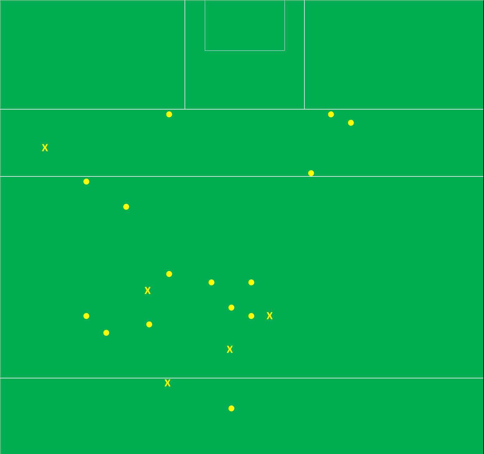
Rory Beggan

No. 1 on “outside” shooting, from those with any volume, plus maintaining an above average return on the “ultra” length (40% versus a 32% average without his attempts included). The idea of a wrong side (right footer from the right) dissipates when we are shooting from such long range distances as the narrowness of the angle of the goalposts lessens, however it is still evident in Beggan’s chart. He is deadly centrally (80%; 0-16 rom 20) but if we draw a line up from the edge of the D he is 42% (0-07 from 17) on the right and 55% (0-06 from 11) on the left.

But that is nit picking. His abilities – such length whilst maintaining above average accuracy – is unique and is a deadly weapon. Quite apart from his accuracy just the threat of him means where you foul Monaghan has to come into any opposition team talk – which gives their inside forwards that extra split second to make their runs.

Conor McManus

We can’t talk about Beggan without reviewing Conor McManus. His returns were those that surprised me the most as my go to image of him is always hitting monster points from ridiculous angles. But that image hides a lack of consistency on his free taking; 84% “inside” is poor when you consider the volume he has taken from there.

Now there are mitigating factors. There are five misses from the right (wrong side) which indicates a lack of a reliable left footer whilst the subjective placement of the “inside” line goes against him. A metre further in and five of his misses would transfer from “inside” to “outside”. On top of the five misses inside from the right there are another two “outside”.

There are also another ten misses around the 45 which, when we compare to Beggan’s success there, make no sense as to why he would be taking them. They are obviously outside his zone. But the majority of these were pre Beggan becoming who he is. Eight of those ten central “outside” misses came in the 2017 campaign. Beggan had 12 attempts in total that year. McManus has more or less relinquished those efforts from which he is weakest from.

Seán O’Shea

The GAA’s own holy trinity is completed by Seán O’Shea. His unerring accuracy “inside” gives him a path to overtaking Rock on Conversion Rates but he will want to tidy up the “outside” shooting, especially just to the right of centre, to completely pull away from the other two in Expt Pts

Paul Broderick

Perhaps the most surprising entrant; he is the only member on the list outside of perennial Division1 & 2 teams. That in itself is a testament to the volume of games Carlow have played on their recent journey as well as their willingness to let him have an attempt given his accuracy.

Comments will become repetitive as we go through the players. He knows his limitations so doesn’t take them from the wrong side. The fact that he is left footed helps as “inside” right footed free takers are easier to come by. Again when the angle widens we can see him try some “ultra” attempts from the left. Prone to lapses of concentration – two of his three misses inside are within 25m on his good side.

Diarmuid Murtagh

His accuracy is good but he has been aided by the majority of his attempts being close and central. Again like Broderick the fact he is a left footer helps as Conor Cox & Ciarán Murtagh were able, in the main, to cover his “wrong side”

Neil Flynn

Neil Flynn took over from Kevin Feely as the main free taker in 2018. Overall conversion rate looks low at 71% but as the chart above shows he is reliable with his only two misses “inside” being from (a) the wrong side and (b) a straight on attempt close to the outside range. Has a weakness from centre to right of D for up to ~10metres outside the 45.

Peter Harte

As a unit Tyrone have struggled but Harte has held his own. Again like Diarmuid Murtagh he is aided by the fact that he is, in the main, an “inside” left footed free taker so does not have to take attempts from the wrong side. Again like Murtagh the majority of his attempts are within a specific close in zone – struggles on the edge of the “Inside” zone.

Shane Walsh

The only man to take frees off both feet (white = left foot above, black = right) and it is a testament to his two footedness that he is up there. The only other player I came across with this level of two footedness was Kevin Feely. Walsh was 94% (0-16 from 17) off his left “inside” and 85% (0-17 from 20) off his right. A bit of inconsistency with close in misses whilst Galway could develop a wide/long range shooter to take some of the pressure off as he struggles wide outside

Ciaran Murtagh, Conor Cox & Conor McAliskey

Murtagh & McAliskey had four attempts between them in 2019 whilst Cox’s volume is too small to extract too much from. All three come out with average returns on Expt Pts. Once again a reminder that average here is not bad – this is average in the context of the best players in our game in possibly the era with most collective accuracy ever.

Niall Morgan

Niall Morgan has an obvious comfort zone right of centre around the 45 (81%; 0 – 09 from 11). Everywhere else he has struggles (15%; 0-02 from 13). Playing amateur psychologist Tyrone see these as shots to nothing but there are consequences to such low returns – are they affecting Morgan’s confidence? Could Tyrone have scored more than 0 – 02 if they had gone quick with these attempts? Low volumes but poor enough game management.

Michael Murphy

Michael Murphy’s overall Conversion Rate at 66% is low but the perception, or mine at the very least, is that this was ok given the volume of his long range efforts. To some extent this is true as just under half (36 of 74) of his attempts come from “inside”.

And he is as good as the next man from “inside”. But this perception hides the fact that his long range shooting has not been up to scratch. He is, or at least has shown in Championship, that wide left, when he has, from distance, to swing them in, does not suit him.

For “outside” his returns of 45% are well below the average of 57%. Even more so when compared to those of the holy trinity – Rock, Beggan & O’Shea combined for 71%; 0-55 from 77.

Cillian O’Connor

In many ways Cillian O’Connor is the hardest player to peg. And the most surprising. I wrote on this subject, in what feels like a different lifetime, back in 2016 when O’Connor came out on top. He was the Dean Rock of 2013 – 2016. But this portion of his game has obviously regressed from there.

His “inside” shooting is still as metronomic as ever with his only misses coming from the right (due to the fact that Mayo have been unable to rely on a left footed free taker) and two out wide right on the subjective partition line.

The original “inside”/”outside” demarcation was not built on O’Connor’s data but it could well have been. The minute he steps outside that range his returns begin to plummet, from 94% “inside” to 41% “outside. This is the biggest drop of any player with any volume. The cherry on top being that he has missed all six from the “ultra” range.

Mayo have to help O’Connor here. Develop a left footed free taker. Transfer those longer range attempts to someone else. His brother perhaps? If you can’t do either start going short. Do something because what has happened for the last three years hasn’t worked.

Appendix

Note1: We must also understand that there are elements not captured. The impact of weather. The differing grounds. Pressure. Taking a free one point behind in an All-Ireland final is very different than taking one when ten points up in a Leinster final. We know all of these have an impact but that impact is not measured here.
We must also always be cognoscente of the small volumes involved

Note2; Roscommon & Tyrone were chosen given their relative success in the timeframe. We had the main free takers for the other “big” teams. Both of these had made the Super8s in both years

O’Connor & Rock from frees (Rd3 of league)

March 3, 2017

From an analysis and review standpoint I am forever railing against recency bias. This “railing” comes about however because of its pervasiveness. It’s an in-built near automatic response. And of course I fell into the trap myself.

Watching the Mayo – Roscommon game last week Cillian O’Connor missed a central free about 33metres out and I had immediate flashbacks to (a) a number of missed frees in the previous round against Kerry and (b) that missed free in last year’s All Ireland final.

Was this latest missed free a sign of some cliff having been reached? Was one of Mayo’s most consistent weapons beginning to malfunction? Of course not.

oconnor-post-rd3

In the three league games to date O’Connor has hit 79% of his frees. Well above the ~72% Championship average. On Expt Pts his tally is -0.39; he has basically scored what is expected. Now the argument could be made that someone with O’Connor’s reputation should be in positive Expt Pts territory. Fine. However we must always remember that the Expt Pts tally is based off Championship returns. Frees taken in (mainly) pristine weather on (mainly) pristine surfaces. O’Connor is fine. To be slightly off in the middle of the league is acceptable? For comparison Dean Rock is running at 75% conversion rate with an Expt Pts tally of -0.86.

rock-post-rd3

What I did argue however in last year’s All Ireland review is that O’Connor had an arc outside of which he was vulnerable (the missed free in the drawn All Ireland being right on this arc). Given weather, pitch conditions etc. it is fair to expect that arc to contract at this time of year and if we placed this contracted arc over O’Connor’s frees to date then I would suggest that arguement is still relevant. He has taken 6 frees on the edges of this constricted arc and converted 3 – 50% Success Rate. He has also missed his only 45.

So in conclusion – bloody recency bias!! But O’Connor is generally fine and still remains one of the most consistent free takers once within his range.

Early Conversion Rates are poor – why?

November 10, 2016

Early Conversion Rates

Whilst uploading the 2016 data into the database I was noodling around in the numbers and produced a simple chart for production on Twitter.

graph-1-overview

Something was quite obviously happening in the first 10 minutes that saw the cumulative Conversion Rates much lower than the average. There were two initial thoughts

1. a number of “lower level” teams were dragging the average down early in games (either through just poor shooting or an inability to get “quality” shots off against better teams early on when the scoreboard was close)
2. shooting types, and where shots were being taken from, were so different in the frantic opening periods of games that the early Conversion Rates were being skewed

Upon doing some more superficial digging it appears that neither were the case

1. Conversion Rates by teams

graph-2-by-team

The phenomenon (of Conversion Rates being lower early on) was observed in three of the four semi-finalists (NOTE1) whilst all other teams followed the overall trend to a tee. The only outliers – unsurprisingly – were Dublin.

2. Expected Points over time

graph-3-expt-pts

The above is a replica of the Conversion Rate chart but replacing Conversion Rates with Expected Points (Expt Pts). Although the shape of the chart is different than the original the occurrence of poor early returns is still evident. And by using Expt Pts we remove the shooting types as an issue as Expt Pts bakes in the difficulty of a shot (NOTE2). All shots are being converted at a lower rate than expected until around the 30th minute but teams are noticeably struggling in the first 15 minutes.

Conversion Rates by shot type

So the phenomenon is real but cannot be attributed to a specific team type nor to shot selection/execution. It is across the board except for Dublin. Three shots types – free kicks, point & goal attempts from play – make up ~97% of all shots. Is there anything we can determine from investigating these shot types independently to explain this poor shooting in those early exchanges? And is there anything therein that explains how Dublin are managing to avoid this poor shooting early on?

Free kicks

graph-4-by-free

This is probably the most surprising, and hardest to attribute, of all the results. When the very first chart was produced on Twitter I mischievously suggested that whatever all the back-up teams were doing to get teams warmed up they needed to change it. There were some good responses re the intensity of teams, especially in the pressure applied to shots, being higher early on. Or that teams were defensively more conservative early on leaving less space for clear shots. All plausible and probably have a grain of truth. However none applicable to free kicks – and the phenomenon of poor conversion rates early on is noticeable here too.

Now by slicing the volumes into the first 10 minutes of one season’s games we are running in to sample size issues. Specifically for this segment the volume is 47 so this comes with a rather large health warning.

Assuming games are now 80 minutes the first 10 minutes make up 12.5% of the game; the 47 frees in the first 10 minutes make up 13% of all frees. On top of that the two main free takers – D Rock & C O’Connor – make up 21% of all frees in the first 10 minutes whereas they make up 25% of all frees in the database for 2016. So the first 10 minutes, low sample size and all, are representative of the whole year. So what happens in those opening 10 minutes?

Shots Scores Expt Pts Conversion % v Expt Pts
All frees 47 29 32.8 62% -3.8
Rock & O’Connor 10 9 7.8 90% +1.2
Others 37 20 25.0 54% -5.0

What the above table shows is that Rock & O’Connor were on point from the get go. Overall for the year they combined for an 86% Conversion Rate and in the first 10 minutes they were 90%.

If the two main protagonists were on point the rest of the free takers must be dragging the averages down from 71% overall to 62% in the first 10 minutes. And as the table shows this is the case. Indeed they were very poor returning a paltry 54% (the 80 minute average for all free takers outside Rock & O’Connor was 66%).

And this somewhat negates the argument for lower Conversion Rates early on being affected by what the opposition’s defence is doing. The opposition can’t really affect free taking. Outside of Rock & O’Connor it looks like free takers were just not ready early on (NOTE3).

Points from play

graph-5-from-play

The Conversion Rate for 2016 was 44.2% and for the five years from 2012 was 45.8%. For the first 10 minutes of 2016 games the conversion rate was 36% and only rose to a cumulative 38% by 20 minutes. Again the Expt Pts was lower in the first 10 minutes (-15.70) as against the remainder of the game (+5.84).

I do track whether a shot was taken under pressure however have only used it anecdotally to date as it is a simple “Y/N” flag and is probably not nuanced enough for any concrete use. Having said that however there is only one person applying the flag so we would expect a certain degree of consistency of application across the ~1,000 shots tracked here.

In the first 10 minutes I charted 53.6% of all point attempts occurring whilst under pressure. The remainder of the time it was 54.2%. Near enough as makes no difference.

So the poor shooting for points from play is real, is not linked to poorer shot types (as evidenced by the Expt Pts return) and from the empirical data we have is not linked to greater pressure applied earlier on in the game. I am completely open to the intensity of the pressure being different early on (NOTE4) but if this was the case you would expect some uptick early on in the percentage of shots marked as taken under some/any pressure in this timeframe. There is none.

There may be other non measurable factors such as nerves (these are amateurs after all) but as of now I can’t come up with anything other than the aforementioned “mischievous” reason that players are just not at peak performance early on. Maybe this is to be expected?

So what of Dublin? We saw that their early conversion Rates outperformed everyone else. This is in part due to the fact that Dean Rock went 5 from 5 on his frees but how was their shooting from play?

Shots Scores Expt Pts Conversion % v Expt Pts
Dublin 23 9 10.2 39% -1.2
Mayo 28 8 12.0 29% -4.0
Tyrone 19 8 8.7 42% -0.7
Donegal 17 4 7.4 24% -3.4
Tipperary 13 5 6.8 38% -1.8
All first 10 179 65 80.7 36% -15.7

Again volumes are low (NOTE5) but Dublin were no great shakes early on. Yes they were above the average for the first 10 minutes but they still underperformed when compared to the whole game average and their Expt Pts – like all the teams above – was below 0.00.

Perhaps the most striking return here is Mayo. From the 10th minute onwards they were exactly in line with Dublin (Mayo 49% on 126 shots with an Expt Pts of +5.59; Dublin 49% on 132 shots with an Expt Pts of +5.54) but for those first 10 minutes they were much poorer.

Another theory for the poor start was not where teams were shooting from but who was shooting – less pressure on returns early on so midfielders/defenders were more inclined to “have a pop”. So I had a look at Mayo’s shot distribution. In the first 10 minutes 64% of their shots came from what I would state are obvious offensive players (A Moran, A O’Shea, J Doherty, A Dillon and the two O’Connor’s). From the 10th minute onwards, and adding E Regan, C O’Shea and A Freeman to this mix who didn’t have a shot in the first 10, these forwards accounted for 60% of point attempts (NOTE6).

It is difficult to attribute offensive/defensive tags to all players in today’s game but if there was a decisive split in who was shooting for teams you would expect it to show up in the team with perhaps the worst split. But it doesn’t.

Goal Attempts

graph-6-goal-attempts

To be honest I am just including the above for consistency and to help explain Dublin’s apparent ability to start faster than others. Whilst I have consistently cautioned against low sample sizes it is an overarching feature of this shot type and can explain a lot of the variance within the five minute groupings above. In total there were 137 goal attempts with just 15 in the first 10 minutes and 36 within the first 20.

Having said all that …. the Conversion Rate for goal attempts was 53% in 2016 and only crawled up to 40% after 15 minutes. With the evidence we have teams again were not converting on goal attempts early on in games.

Dublin? They had six goal attempts in the first 10 minutes scoring 3-00. 50%. And there is their apparent early start in a nutshell. They were 50% on goal attempts, 100% on deadballs (as well as Rock’s aforementioned frees he was 2 from 2 on 45s as well) and slightly below average at 39% on point attempts – giving them the aggregate of ~52% early doors.

Overview

This is based on one year’s data (NOTE7) but poor early conversion rates were definitley a “thing” that year

There is no evidence that shot selection (through Expt Pts), opposition pressure (through the simple “Y/N” flag) nor type of shooter (using Mayo as an example) is any different in the first 10 minutes to the rest of the game

It is also evident in early free taking, except for the very best in Rock & O’Connor who were on point from the very start, which somewhat nullifies the theory that it is something the opposition is doing to affect the shooting.

There are undoubtedly other factors at play. Some can be measured; first shot in the game, effect of new surroundings, debutants vs more experienced players, intensity of pressure. Some we may never be able to measure – nerves, mentality of players early on versus later in the game, etc.

But as of now, and taking all of the above into account, I cannot escape the initial gut reaction that players are just not ready – for whatever reason – early on

NOTE1 – we need to be careful with any segmentation. There are only 1,640 shots in total being reviewed here with 249 in the first 10 minutes. Segment that further by team and you get some ridiculous numbers; Kerry just have the 7 shots across two 2016 games; similarly Tipperary only have 16 shots in the same timeframe. You can’t make any judgements on those numbers. In truth I would not normally use a chart with such low volumes but I include it here as it was the chart that sparked me into looking deeper into the issue.

NOTE2 – for more on why this is so please see here

NOTE3 – I had a further look at the non Rock & O’Connor frees to see if any one player was having an effect. There was none really. 34 of the 37 were a player’s first attempt in the game which makes sense as it is uncommon for a team to have two shots at goal from a free in the opening 10 minutes.

This leads to a further corroboration that could be investigated – across the year’s how does a player’s very first free kick equate to the rest of their results?

NOTE4 – I started to grade pressure on a sliding 0 – 3 scale for the two All Ireland finals. It feels a lot more robust as having to apply a grade makes you stop and think. It will be very instructive from here on in but as of now I’m not inclined to go back over the entire season to retrospectively apply the grade(s)!

NOTE5 – This table lists all the teams with >10 shots from play in the first ten minutes. Again we are running into sample size issues.

NOTE6 – the non offensive players with a shot in the first 10 minutes were B Moran, D Vaughan, K McLoughlin, L Keegan, P Durcan & T Parsons. Other defensive players with shots post the 10th minute were C Boyle, K Higgins, S O’Shea, S Coen, B Harrison & K Keane

Note that whilst some of these could be moved into the “offensive” pot their individual shot volumes are such that it wouldn’t make a material difference to the overall point.

NOTE7 – why one year? Because for some unknown reason I didn’t track the time (outside of 1st half/2nd half) for previous years. Hell of an oversight in retrospect! The only reason I started in 2016 was I was so bored of looking at kickouts so decided to look at the rest of the game. I have one or two other pieces I newly gathered in 2016 so hoping to get another long form piece out on those

2016 Shooting review

November 2, 2016

Time for the annual review of how the season’s shooting went.

All shots Frees Point attempts Goal Attempts
2012 51.7% 70.6% 47.3% 39.8%
2013 50.5% 70.6% 44.7% 41.9%
2014 51.3% 76.8% 44.8% 47.9%
2015 53.8% 70.9% 48.5% 51.2%
2016 51.5% 71.1% 44.2% 52.9%

In truth 2016 was an average year. The three shot types listed above account for 96.4% of all shots and whilst there is some movement in each category there is nothing that really warrants further investigation.

Frees

This has been *the* most stable metric since the inception of the blog and 2016 was no different. Slight uptick but nothing exceptional. We looked at the 2014 increase here and, at the time, attributed it to better accuracy for closer in frees.

Point attempts

2015 saw an increase in accuracy for point attempts however this was a blip rather than the beginning of any trend as 2016 returns slipped back to 2013 & 2014 levels.

Goal attempts

The step up in accuracy observed in 2014 & 2015 was maintained in 2016. Teams have definitely become better at getting a return from their goal chances but not necessarily at their finishing. The above table includes any goal shot that returned a goal or a point. If we strip out the points then the goal conversion rate is 35%, 32%, 36%, 41% & 40% respectively. The step up in 2014 & 2015 is evidenced again however was maintained, rather than built upon, in 2016.

The best free taker?

June 17, 2016

This piece originally appeared in the Examiner’s Championship pullout. I had intended to link to it but it does not appear to be online so I have reproduced it below

The dearth of GAA data can lead to some curious problems. Take measuring the best free takers for example.

Normally all we get in any match report is a list of the scorers and how many of those scores were from frees, 45s etc. Rarely will their scores be put in the context of how many shots they had, how hard these shots were etc. Is the best deadball exponent (although frees make up well in excess of 85% of all deadball attempts we really should introduce penalties & 45s into the conversation) the player that scores the most? The one that converts the most? Neither?

Conversion Rates

The below table shows the Conversion Rates for any player with a minimum of 30 recorded deadball attempts over the last four Championships

Player Shots Scores Conversion Rate
D Rock (Dublin) 33 28 85%
C McManus (Monaghan) 48 39 81%
C O’Connor (Mayo) 112 90 80%
B Brogan (Dublin) 49 38 78%
C McFadden (Donegal) 54 41 76%
D McCurry (Tyrone) 39 27 69%
M Murphy (Donegal) 85 57 67%
M Newman (Meath) 39 26 67%
E O’Flaherty (Kildare) 36 24 67%
B Sheehan (Kerry) 41 25 61%
S Cluxton (Dublin) 56 31 55%

In and of itself this is noteworthy. Many would have placed the likes of McManus & O’Connor at the top of the charts but the long range experts such as Sheehan & Cluxton, who would also have had their proponents, are lower down the rankings.

This does highlight an issue with using Conversion Rates as shot difficulty (both in distance & angle to the goal) is not taken into account. Of Cluxton’s 56 attempts a remarkable 71% (29 x 45s & 11 x frees) were taken from the 45m line or further out. As a point of comparison only 10% (4 x frees & 1 x 45) of McManus’s 48 attempts were taken from the same range. How does McManus’s 81% Conversion Rate stack up against Cluxton’s 55%? Would we say that McManus is that much better of a deadball striker?

Expected Points

By dividing the pitch into segments, and using the results of well over 1,400 attempts, we are able to show what percentage of deadballs are scored per segment. We use this percentage to create an Expected Points (Exp Pts) return – along the lines of Expected Goals for soccer – for every attempt. So if a free from a specific area is converted 60% of the time the Exp Pts = 0.6pts. Doing this for every deadball attempt then allows us to compare players on a more equal footing.

Player Shots Scores Conversion Rate Conversion Rate Rank Total Pts above Expected
C O’Connor 112 90 80% 3 +7.4
C McFadden 54 41 76% 5 +6.1
M Murphy 85 57 67% 7 +4.2
C McManus 48 39 81% 2 +4.0
D Rock 33 28 85% 1 +3.7
S Cluxton 56 31 55% 11 +2.1
B Sheehan 41 25 61% 10 +0.9
M Newman 39 26 67% 8 +0.7
D McCurry 39 27 69% 6 -0.3
B Brogan 49 38 78% 4 -2.2
E O’Flaherty 36 24 67% 9 -4.1

This shuffles the ranking somewhat. The aforementioned Cluxton & Sheehan rise up the leaderboard as the difficulty of their respective attempts is filtered in. We also see the reverse as players with higher Conversion Rates drop down the ranking – Rock & Brogan noticeably.

Brogan is interesting. He only attempted three free kicks in 2015 meaning that the majority of his returns were pre the emergence of Dean Rock. Looking at the above it is easy to see why the free taking duty was passed to Rock. Although Brogan’s Conversion Rate was high at 78% – placing him 4th overall – the negative Exp Pts shows that he was missing too many easy chances. Of his 48 attempts 22 (46%) came from inside the 20m line; and he missed five of those.

Not that Rock is without his issues. In 2013 & 2014 he was an excellent 92% (11 from 12) on frees though this tally was racked up late on in games where the result was never in doubt. He started 2015 in similar form converting 93% of his first 14 however he then tailed off in the later rounds missing three of his last seven against Mayo & Kerry. Dublin have not looked to cultivate a free taker during the league campaign, so they have faith in Rock, however we won’t know if his late 2015 misses were just a small sample size or something else. If it occurs late on again when the pressure is at its most intense will Dublin be able to switch? Brogan, whilst an able deputy, is no better than average whilst Cluxton only hit one from seven in the semi-final onwards last year after coming in cold.

Cillian O’Connor

One of the more noticeable aspects of the Exp Pts table is how Cillian O’Connor & Michael Murphy rise to the top. The argument can be made that the more attempts you have the easier it is to build up an Exp Pts tally – that of course ignores that the opposite is also true. The more attempts you have the greater the opportunity to regress to the mean.

That O’Connor has maintained such standards across multiple Championships is a remarkable feat. Even more so when you consider that the methodology does not account for the majority of his attempts occurring in high pressure games (Provincial finals, All Ireland semi-finals & finals) whilst also being a load bearing totem. He has taken 76% of Mayo’s deadball attempts switching from the left to the right as well as taking high pressure penalties and the majority of Mayo’s 45s.

O’Connor’s consistency is beyond reproach and it is this, alloyed to his proven accuracy, that surely gives him the title of “the best free taker”.

NOTE: Due to space limitations I wasn’t able to expand on certain points in the article. One I wanted to address was E O’Flaherty’s returns. The above paints him as a very poor free taker which is incorrect. He is in fact a very good free taker but within his wheelhouse. By that I mean between the two 20m lines and to the left of the goals. The problem was that for years Kildare did not have a left footed free taker – or a long range one for that matter – so he was being forced to take shots that other designated free takers did not.

Frees from the Ground or the Hand; (’12 – ’15)

January 25, 2016

An article by Martin Breheny during the week had a pop at Mickey Newman for not taking a 35m free from the ground (it’s the O’Byrne cup. In January!).

Kevin Egan (@lonesharkoy on twitter and a great read in his betting columns for betswot) bemoaned the fact that the article was based on a sample size of one. One! And that maybe, just maybe, Newman might know what’s best for him when taking a free.

This is old ground. Conversion rates for frees from the hand and the ground were covered in two early pieces (see here and here). Just like now the catalyst for the original piece was commentators bemoaning the lack of a particular skill. The Breheny article, and discussion on Twitter in its aftermath, got me curious as to whether the results of the initial study had changed at all now that we had so much more data.

The short answer is it hasn’t. Overall players convert frees from the hand at a 20% rate better than from the ground.


Attempts Scores Success Rate
From the Hand 789 623 79%
From the Ground 405 239 59%


That 20% gap is a bit sensationalist. Where frees are taken from does have an impact on overall conversion rates. The majority of frees (78%) taken from outside the 45 are taken from the ground. Frees from outside the 45 are converted at a relatively paltry 38% so including these will automatically dampen the results for frees from the ground. If we exclude theme does it change anything?


Attempts Scores Success Rate
From the Hand 753 608 81%
From the Ground 281 193 69%


The answer is yes and no. Yes the difference between the two is narrowed significantly but the central tenet holds true – players are better at converting from the hand than they are from the ground. Indeed the gap has grown slightly from three years ago when similar splits saw results of 79% from the hand and 68% from the ground.

Shot attempts are further segmented by sector (see sector breakdown here) so we are able to take a more granular look.


Sector From Ground From Hand
4 58% 63%
5 81% 84%
6 51% 70%
7 72% 79%
8 96% 98%
9 78% 80%


Frees from the hand not only outperform those from the ground but do so in all sectors. Including, perhaps a touch surprisingly, the very central ones. I say surprisingly because with frees out wide I can understand how players taking them from the hands make it easier on themselves by stealing a few yards. That doesn’t really enter the equation with the more central ones.

As stated in 2013 I have no problem with people lamenting the loss of a skill but surely Mickey Newman, or any free taker, knows the best way to approach any particular free? The fact that the numbers back up using your hands is just a nice happenstance.

What’s the betting we will be revisiting this in 2017?

An Ode to Cillian O’Connor’s right foot

October 28, 2014

Originally this was going to be a follow up to the deadball accuracy piece in which I would highlight any interesting tidbits that had popped up whilst reviewing the past three years. Instead it is going to be an ode to Cillian O’Connor.

Attached below is the chart I initially posted on twitter (@dontfoul) showing the accuracy for the players with the ten most attempts since 2012.


Player deadball


O’Connor came out on top in terms of Success Rate. But he did so whilst also attempting the most deadballs. He had volume on top of his accuracy. He also maintained this accuracy in some of the most highly pressurised situations. In the three year span that the returns covered Mayo have appeared in 13 TV games with three quarter finals, four semi finals and two finals amongst them. Most impressive.


Deadball accuracy v2


What is even more impressive is the fact that O’Connor has recorded the highest weighting in this interval as well. He is not just tapping over simple 14m frees to maintain his Success Rate. His weighting reflects the fact that he is converting frees of an above average difficulty at an above average frequency (as a counter point note Bernard Brogan – a well above average Success Rate but a barely positive weighting – he is merely converting the frees that an average free taker would convert but because of Dublin’s volume of attacks he gets to take more frees).

It is not just volume that is leading to a higher weighting either. On current trajectories only Cluxton is in line with his weighting. So how has he done it?


Deadball Type Attempts Scores Success Rate Average Weighting
Frees
inside 20m 24 23 96% 88% +2.64
20m to 45m 35 30 86% 71% +5.375
outside 45m 3 0 0% 40% -1.210
total 62 53 85% 72% +6.803
45s 7 4 57% 47% +0.630
Penalties 3 3 100% 82% +1.778


O’Connor’s accuracy is above the average in all three of the deadball categories – frees, penalties & 45s – that he has attempted. His weighting has been aided by converting three penalties (for a longer explanation on why penalties have such high weighting see here) but on the flip side he has attempted three frees from outside the 45 for which he patently does not have the “legs”. As an illustration see a chart of all his deadballs, excluding penalties, this year.


OConnor14
x = missed, disc = score,black = free, white = 45


O’Connor’s only missed two frees from inside 40 metres in 2014 and one of those was the desperation goal attempt in the semi final replay at the end of extra time. His accuracy from c40 metres in is genuinely exceptional.

What Lies Beneath – Success Rates for Various Shot Types

June 25, 2014

This was originally published over on livegaelic before the season started – I meant to put it up here but have only gotten around to it now.

Introduction
I have been gathering data on Championship games since 2010. Unfortunately I do not have any games from 2011 however for the other three years 86 games have been charted with 6,593 attacking possessions and 4,805 shots recorded.

There have been minor adjustments over the years as to how the data is gathered. Where this is the case any extrapolation will be highlighted. We also have to take into account the fact that all the games are charted manually so there will be errors and inconsistencies however I am confident that they are minimal as (a) I don’t do games live and have the benefit of time to review and check and (b) I do all the games myself so how I interpret actions (a shot, or pressure for example) will be relatively consistent.

Overall

Year Games Possessions Avg possessions Shots Shot Rate Scores Success Rate
2010 36 3,013 83.7 2,041 68% 1,016 50%
2012 25 1,764 70.6 1,351 77% 698 52%
2013 25 1,816 72.6 1,413 78% 713 50%

There are a few things that jump out from this one table alone. The main one is the contrast between 2010, in terms of average possessions per game and Shot Rates, and 2012 & 2013. They are quite a way apart given how consistent ’12 & ’13 have been.

There were 44% more games in 2010 and given that these would all have been earlier in the Championship I did wonder if there was something in the quality of the games recorded that was producing this result. As such I extracted the same seven games from each year (4 quarter finals, 2 semi finals and the final) and compared them

Year Games Possessions Avg possessions Shots Shot Rate Scores Success Rate
2010 7 579 82.7 413 71% 209 51%
2012 7 492 70.3 377 77% 204 54%
2013 7 510 72.9 388 76% 205 53%

The Shot Rate gap does shrink but the Avg. possession rate remains stubbornly different. We do know that football is a copy cat game – 2011 saw the emergence of the Donegal wall as well as a tempered Dublin. It could be that following both those teams’ success an emphasis was placed on minding the ball. Recycling the ball and attempting to take more quality shots, rather than a greater quantity of shots, seems to be in vogue.

As an aside it is interesting to note that the higher profile games – quarter finals onwards – where one would expect more evenly matched teams brought about higher Success Rates. Despite, in theory, these games possessing better defences the Shot Rates remained relatively static in ’12 & ’13 but the Success Rates increased. At a very, very generalized level the better forwards outperformed the better defences.

Shot Outcomes
From Play
Before we move on to looking at the various shot types below is the outcome of all shots from play.

2010 2012 2013 Total
Blocked 7% 6% 7% 7%
Goal 4% 4% 4% 4%
Goalkeeper 7% 6% 5% 6%
Point 41% 42% 40% 41%
Saved 2% 3% 4% 3%
Short 6% 5% 7% 6%
Wide 34% 30% 31% 32%
Framework 3% 2% 1%

There is a remarkable consistency to these outcomes. 44-46% of all shots end in a score (goal or point) whilst 33 – 34% of all shots were wide each year (note that in 2010 all shots that hit the framework were considered wide … these were separated in ’12 & ’13). Now we know that the type of shot will have a big bearing on the Success Rates however if you are a member of a club then by simply tallying the outcome of your team’s shots you will know how far off inter county standards your team’s shooting is.

The only real “trend”, and it is a minor one overall, is the fall in the number of shots dropping into a goalkeeper’s hands. It has fallen from 7.4% of all shots in 2010, to 5.8% in ’12 and 5.4% in ’13. I would be surprised if this was due to anything other than teams preaching a mantra that emphasises minimizing turnovers; the belief that it is better to kick the ball wide, and set for the kickout, than let your opponent start a counter attack when the team is not ready. It would be interesting to see how many shots a team gets from possession garnered from balls dropping into the keepers hands versus from kickouts. Another one to add to the ‘to do’ list.

Knowing that 45% of all shots from play end in a score is useful. It can be used as a convenient benchmark. However there are a lot of other factors that feed into whether a particular shot will be successful or not; strength of the wind, where on the pitch the shot was taken from, rain, strength of the opposition, whether a defender was placing the shooter under pressure to name but a few.

A lot of these are subjective (pressure?) whilst others are difficult to gauge watching games on tape (how do you grade various wind strengths). One factor we have been able to consistently capture however is where on the pitch a shot was taken from.

GAA pitch

I have always used the above segmentation and whilst it has its drawbacks it has two major strengths. One it is objective as all pitches are marked the same and two it is readily transferable across grounds and broadcasters. No matter the camera angle, or trajectory of the sun, you will rarely struggle to place a shooter in the above grid using the pitch markings.

Having said that how do Success Rates for shots for points for the various segments line up?

Sector 2010 2012 2013 Total
1 100% 67% 0% 83%
2 31% 56% 22% 38%
3 60% 0% 40% 44%
4 34% 40% 35% 36%
5 49% 52% 50% 50%
6 37% 36% 34% 36%
7 41% 42% 45% 43%
8 67% 75% 71%
9 40% 49% 38% 42%

The returns for 2010 from Sector 8 are blank as there was no distinction between shots for goals and shots for points in that year. Alongside the returns it is instructive to review where the volume of kicks were taken from (see Appendix).

For shots from outside the 45 (Sectors 1-3) there is a lot of volatility; this is purely due to low volumes however. Only 2% of all shots – 77 shots in 86 games – in the three years occurred outside the 45. It is very difficult to extract anything meaningful from this data.

From year to year there have been fluctuations on the returns from the wings (Sectors 4 & 6) however over the three years there is no difference. Whether kicking from the left or the right the Success Rates are 36%. As a grouping Sectors 4 & 6 combined produce the most shots (38% across the three years) but the returns are relatively poor.

It is not a case that as a trainer or coach you tell your players not to shoot from here but you must know your players and who is likely to at least hit the average on these shots. Paul Flynn probably has licence to shoot from here all day – should Jack McCaffrey? Only if you know, from data gathered in games and training, what his Success Rate is like.

Inside the 20m line there is again volatility over the years but when combined there is practically no difference either. Shooting from the right or the left (Sectors 7 & 9) the Success Rates come in at 42%-43%.

Which leaves us with the centre. Just under a quarter of all shots come from Sector5 whilst 50% are converted. A conversion rate of 50% may seem low for shots more or less in front of goal but in the context of a 36% Success Rate from the Sectors either side of it this is quite a fruitful avenue.

Sector 8, straight in front of goals, surprises me somewhat. Remember these are deliberate attempts for points so goal shots are excluded. These should be the simplest shots in the game but yet a sizeable minority, 29%, are missed. This is where our lack of defensive reference points has a bearing. You would imagine that the vast majority of those missed shots came about due to defensive pressure.

From Deadballs
Success Rates for shots from deadballs

2010 2012 2013 Total
Free 70% 71% 70% 70%
45 49% 40% 50% 47%
Sideline 13% 33% 33% 21%
Penalty 100% 100% 67% 88%
All deadballs 66.3% 66.9% 66.6% 66.5%

Again the level of consistency stands out. Over the three years the Success Rate from deadballs has remained static with the only fluctuations coming from those methods of delivery where volumes are low. Free kicks, as a percentage of all deadball shots, were 84.9% over the three years with a very narrow range (84.7% in ’10, 86.0% in ’12 and 84.1% in ’13). The average number of frees in a game across the three years is 12.4 – with a Success Rate of 70% your average free taker, in an average Championship game, will deliver 4.3 points.

I have always wondered at the low return rates for 45s however in the context that there is only, on average, 1.76 45s a game it is easy to see why players and coaches might deem it ancillary.
Frees only

Sector 2010 2012 2013 Total
1 25% 33% 50% 36%
2 47% 59% 42% 48%
3 42% 25% 38% 37%
4 55% 65% 52% 56%
5 86% 82% 83% 84%
6 58% 56% 61% 58%
7 78% 73% 86% 78%
8 93% 94% 88% 92%
9 94% 75% 75% 84%

Much like shooting from play there are distinct groupings of sectors here. From play we saw that there was a large uptick in Success Rates for shots down the centre inside the 45m. This is also evident in the free taking returns and is extended outside the 45 as well where, unlike shots from play, a large portion of frees emanate from (14% over the three years).

Again there is little difference in Success Rates for frees from the wings; 36% & 37% for frees from Sector1 & Sector3 and 56% & 58% for Sector4 & Sector6.

There is some variation in the outcomes for frees inside the 21m line with 78% of frees converted from the right (Sector7) and 84% from the left (Sector9). This may be due to right footed free takers taking some frees from Sector7 that more naturally fits a left footed free taker – but that is just conjecture on my part.

Pressure

One last piece. Previously we mentioned certain variables that could affect the Success Rate of shots. One that was mentioned was pressure. Although I have tracked whether a shot was taken under pressure since I started doing games I have never used it. The main reason for this was that it was a subjective analysis – put 10 GAA fans in a room and they would come up with ten different definitions.

Still the data is there so lets have a look at the outputs

Year Shots Pressure-yes Scores Success Rate Pressure-no Scores Success Rate
2010 1,513 857 348 41% 649 315 49%
2012 1,007 622 263 42% 377 200 53%
2013 1,024 579 244 42% 438 205 47%

The results are, more or less, as expected. Each year there is a clear downshift, as against the mean, for those shots taken under pressure and an uplift for those taken without pressure. There is also quite a bit of consistency year on year which is quite comforting – it would lead you to believe that whilst subjective how pressure is being tracked is accurate. Definitely a subject worthy of its own piece.

APPENDIX
Breakdown of shots for points from play

Sector 2012 2013 Total
1 0% 0% 0%
2 2% 1% 2%
3 0% 1% 0%
4 21% 21% 21%
5 25% 23% 24%
6 18% 17% 17%
7 10% 15% 12%
8 14% 13% 13%
9 8% 10% 9%

Breakdown of where shots from deadballs taken

Sector 2010 2012 2013 Total
1 2% 4% 2% 3%
2 10% 6% 6% 8%
3 4% 3% 2% 3%
4 16% 16% 18% 17%
5 21% 20% 25% 22%
6 18% 19% 17% 18%
7 8% 7% 6% 7%
8 13% 18% 17% 16%
9 7% 7% 5% 6%

Frees; From the Ground or the Hand – Updated

December 19, 2012

Back at the start of Summer I wrote a piece (here for background detail) about an interesting trend I had spotted; namely that frees from the hand, contrary to popular opinion, were outperforming frees from the ground.

In the back of my mind I did wonder if the mix of games I had charted had somehow skewed the results. I had charted one full season and the early parts of another season. Had this led to more ‘lower grade’ games thus perhaps capturing more below average free takers?

As such I revisited the numbers after two full seasons (I think we’re over 60 games now) and … the gap has increased!

The table below shows that 61% of frees from the ground are converted whilst 77% of frees from the hand are converted. The initial post had shown a 63%-75% split.

Shots Scores Success Rate
Ground 304 185 61%
Hand 439 336 77%


Before proceeding just another quick reminder of how the pitch is segmented

GAA pitch

In the earlier study there was a discrepancy between shots inside and outside the 20m line with frees from the ground inside the 20m line outperforming frees from the hand. The reverse was true outside the 20m line. This is no longer the case.

One interesting point to note is that, despite the wider trends, frees from the ground right in front of the posts (sectors 5 & 8) outperformed frees from the hand. The easier the frees the better you are in placing the ball on the ground. The wider out the pitch you go the better you are taking the free from the hand.

Emmet Ryan over at the action81 website posited that perhaps the ability of free takers to steal a few yards, whilst taking frees from the hand outside the 20m line, might explain why the returns are better for this method out on the wings. This is by far the most plausible reason as to why this could occur. It could also be that players taking frees from the ground are straining for distance/accuracy and that this is upsetting a well honed regimen. It is going to be very hard to (dis)prove either however.

For now we’ll just have to contend ourselves with the knowledge that, irrespective of the reason, your free taker is better taking his shots from the hand.

Segment From Shots Scores Success Rate
4 Hand 68 46 68%
Ground 53 25 47%
5 Hand 100 82 82%
Ground 55 49 89%
6 Hand 73 47 64%
Ground 62 30 48%
20m to 45m Hand 241 175 73%
Ground 170 104 61%


Segment From Shots Scores Success Rate
7 Hand 46 34 74%
Ground 12 10 83%
8 Hand 90 83 92%
Ground 23 23 100%
9 Hand 28 27 96%
Ground 24 18 75%
inside 20m Hand 164 144 88%
Ground 59 51 86%

Frees; From the Ground or the Hand

June 16, 2012

I have heard both Martin Carney & Martin McHugh lament the fact that the art of taking a free kick from the ground is passing. That teams are harming their own prospects by not cultivating a kicker who can take a free from the ground. Their argument, and one that I would suggest is generally accepted, is that taking frees from the ground is more constant. There are less moving parts thus the motion should be more repetitive. More repetitive leads to more reliability which leads to a better success rate (for some reason I have rugby kickers in my head as I write that).

Is this the case??

In entries to date I have noted the results of “deadballs”. This includes all shots from Sidelines, 45s, penalties and free kicks. Sidelines (from the hand) and 45s (from the ground) are the extreme of both cases; they have been omitted as they would probably skew the results. Similarly I have omitted penalties as I’ve yet to chart a missed penalty. Therefore we’ll look at all frees where a shot was attempted and monitor the success rates of those taken from the ground versus those taken from the hand.

Shots Scores Success Rate
Ground 255 160 63%
Hand 282 211 75%

Hmmm. Frees from the hand are more successful than frees from the ground. That’s not a small sample size either; it’s unlikely to be overly affected by one very good (or very bad) free taker. The immediate counter argument I would expect is that frees from the ground are taken from harder positions on the pitch thus there is a bias inherent in looking at the whole population. Luckily we segment the pitch so below are the results for frees inside the 21m line and frees between the 21m & the 45m line.

Segment From Shots Scores Success Rate
4 Hand 46 33 72%
Ground 43 20 47%
5 Hand 59 47 80%
Ground 52 46 88%
6 Hand 46 27 59%
Ground 50 26 52%
21m to 45m Hand 151 107 71%
Ground 145 92 63%
Segment From Shots Scores Success Rate
7 Hand 33 23 70%
Ground 9 8 89%
8 Hand 54 49 91%
Ground 22 22 100%
9 Hand 21 21 100%
Ground 17 14 82%
inside 21m Hand 108 93 86%
Ground 48 44 92%

Frees from the ground show a slightly better return inside the 21m line but overall the success rate for frees from the hand inside the 45m line is better than those taken from the ground (77% Vs 70%)

I have no problem with people pining for the loss of a particular skillset within the game (the midfield ‘fetch’ is one dying out with the advent of the shorter kick out routines) but call it what it is. Nostalgia. Don’t wrap it up in erroneous beliefs. There is no evident benefit to taking frees from the ground.